All about the project
Ho Saksham is a SaaS product designed to help service providers, such as:
Yoga teachers, manage and track their subscribers with ease.

So what can be done?
We created an empathy map to deeply understand Priya’s frustrations, motivations, and pain points. This allowed us to connect emotionally with her challenges and build a user-centric solution.
#Psychology Insight
Exploring user attitudes and behaviors
We created an empathy map to deeply understand Priya’s frustrations, motivations, and pain points. This allowed us to connect emotionally with her challenges and build a user-centric solution.
Empathy mapping of Priya
What Priya Says:
“I want to focus on my yoga classes, not paperwork.”
“It’s exhausting to track payments manually every month.”
“I can’t remember who has paid or who I need to follow up with.”
“Why can’t this process be simpler?”
What Priya Does:
Uses spreadsheets to track subscriptions but struggles to keep them updated.
Manually follows up with students via messages to ask for payments.
Spends hours creating invoices and ensuring they’re sent correctly.
Occasionally forgets to send payment reminders, resulting in late payments.

What Priya Thinks:
“Am I missing any payments this month?”
“I hope I don’t offend my students by constantly asking for money.”
“This admin work is taking time away from what I love—teaching yoga.”
“If I could automate this, life would be so much easier.”
What Priya Feels:
Frustrated: She dreads the repetitive task of managing subscriptions and generating invoices.
Overwhelmed: The disorganization of tracking payments and invoices makes her feel out of control.
Anxious: Worrying about missing payments or making errors in tracking creates stress.
Hopeful: She believes a solution like Ho Saksham could simplify her life.
The problems
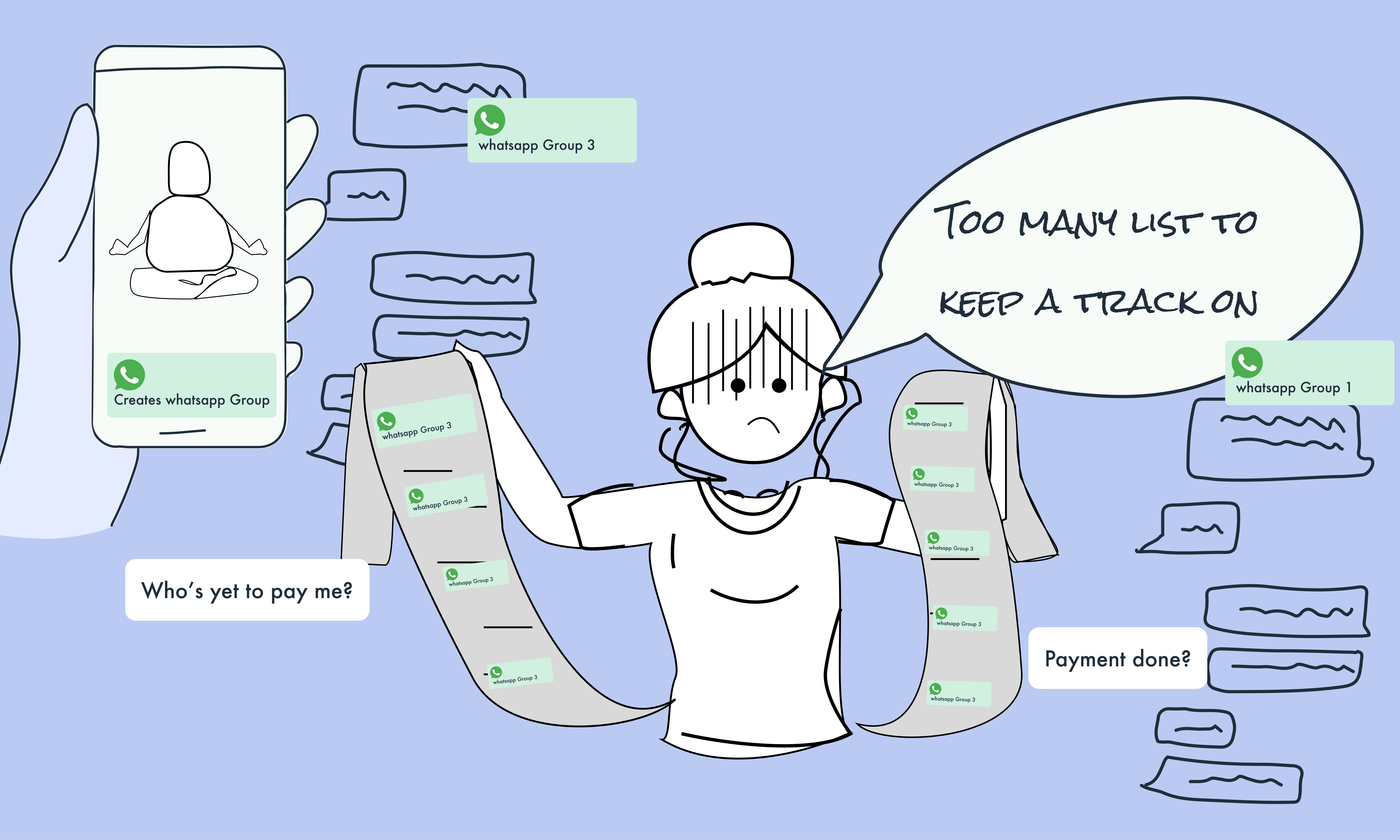
Asking for money from client

Keeping track of who had paid and when they would receive their money was a major pain point for these providers.
Manual tracking
in spreadsheet
Service providers relied on spreadsheets to manually track which subscribers had paid for their services each month. This process was cumbersome and prone to errors.
Invoice Generation
Manually
Providers had to manually generate invoices, either monthly or every time someone used their service, which was time-consuming and prone to oversight.
Uncertainty in Payments:
Thank you for building such an empowering tool, especially for designers! The site went from Figma to Framer in less than a week!
#Psychology Insight
Hick’s Law
When designing Ho Saksham, Hick’s Law initially influenced our thinking about simplifying Priya’s dashboard.
We prioritized reducing cognitive load. The tool was designed to limit options and show only relevant, actionable information, making decisions faster and easier for Priya.
Bringing the Solution to Life
Key Features

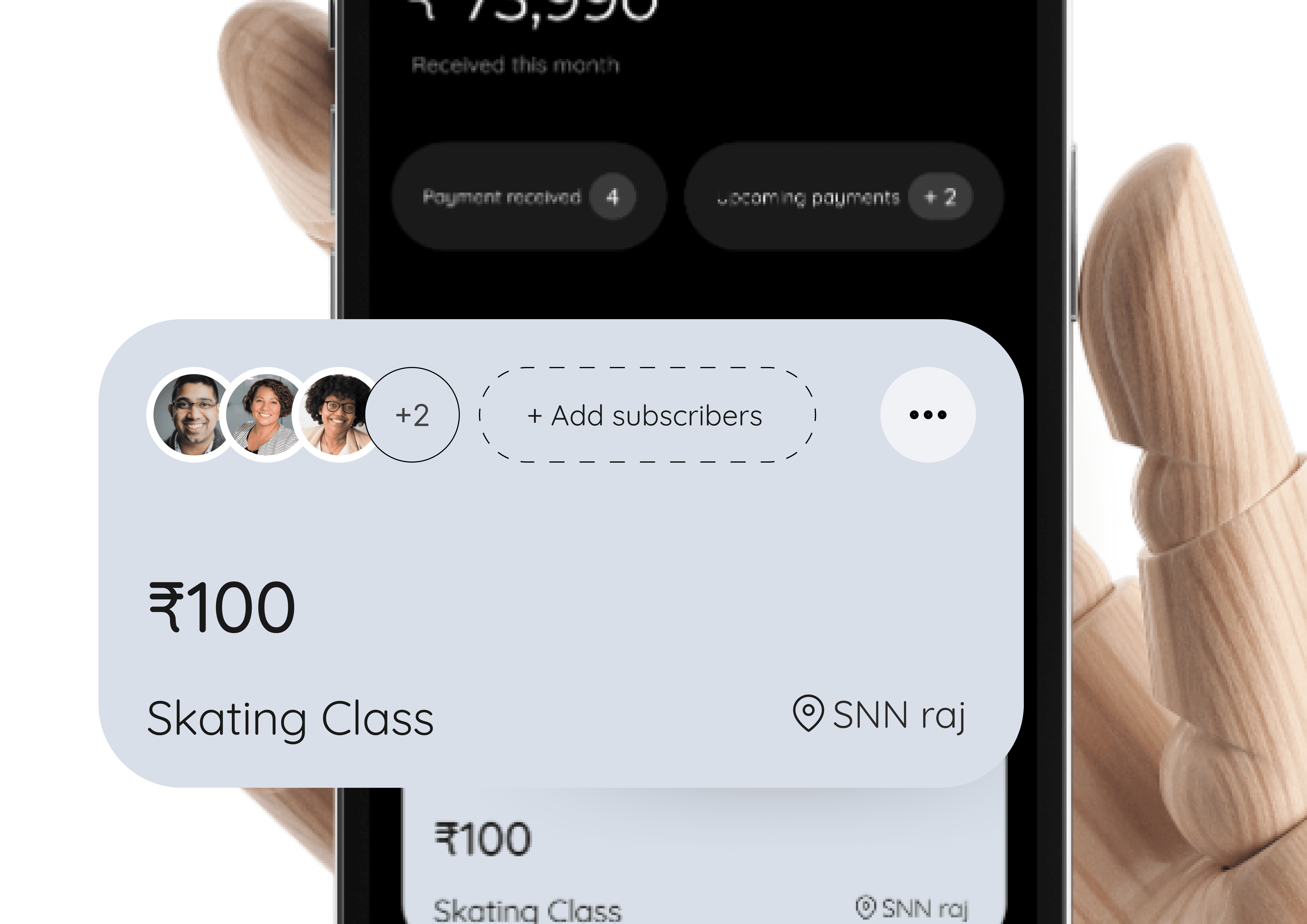
Receieved overall payments
Connect your site to the most popular apps out there.

Subscription Plan and Subscribers
Add effects with a few clicks and capture your audience’s attention when they land on your website.

Add bank account
Design your site on a familiar free-form canvas. Visually set up your breakpoints to make it responsive.


Payment centric
Send payment link via whatsapp, and receive payment directly into bank
Proof of money
Generate monthly invoice
Custome plan
Create plan and add subscribers
The Priya's story before and after the solution.


The design decision
User-Centered Design (UCD)
By involving Priya in every step, we ensured her feedback directly influenced the product. Co-creation gave her ownership and increased her trust in the tool.

When there no direct competitors
The closed competiors we go was ZOHO for billing

How might we
Use the exiting habit:
Make it look like money being store using this app
track subscribers who made the payment,

How might we
Use the exiting habit:
Make it look like money being store using this app
track subscribers who made the payment,

Given the problem and the need

They user Excel sheet to track their subscribers
The Impact (So far)
#Psychology Insight
Zeigarnik Effect
We utilized this principle in the notification system by showing incomplete tasks (e.g., unpaid invoices) on the dashboard, encouraging Priya to act promptly and complete them.
Fewer errors
Fewer errors in managing subscriptions.
Time savings
Time savings from automated invoices and notifications.
Reduced stress
Reduced stress from knowing exactly who had paid and when.
Easy reminder
Notifications have ensured Priya never forgets key actions like sending reminders or invoices.
#Note
While we’ve only worked with one user so far, the initial feedback is promising. Our next step is to expand testing with a broader audience and gather more data to refine the experience further.
Lessons
A Thoughtful Application
Hick’s Law inspired early discussions about simplifying Priya’s interface. However, our deeper understanding revealed that context-specific psychological insights were more impactful than rigid adherence to the law. This approach allowed us to create an experience tailored to Priya’s needs, blending clarity, organization, and efficiency.
By embracing the nuanced role of Hick’s Law in HCI, Ho Saksham became a tool that supported Priya’s decision-making seamlessly rather than just adhering to a “less is better” philosophy.
Work Smart with
Limited Data
Without extensive user data, we relied on deep interviews and contextual observations. This approach underscored the importance of qualitative research and co-design in the absence of large-scale testing.
Start Small, Iterate Fast:
Collaborating with a single user (Priya) helped us focus deeply on her core pain points. By iterating on real-world feedback, we ensured the design was practical and aligned with her needs.
Leverage UX Psychology
Thoughtfully
Understanding psychological principles like Hick’s Law, Zeigarnik Effect, and Hick’s Law’s nuances helped us design intuitive solutions that supported Priya’s mental models without overcomplicating the interface.
Adapt to Resource Constraints and New Tools
Working with the free version of Figma and experimenting with tools like Framer challenged us to think creatively and adapt to limitations. Without advanced design system features, we relied on manual checks for design consistency and efficiently reused components. Framer, on the other hand, allowed us to prototype interactive experiences and dynamically test design ideas
And Finally…
Sure, the case study structure might not be perfect. Maybe it’s missing a bit of flair here, or a sprinkle of polish there. But hey—just like Ho Saksham, we made it work with what we had. And here we are, ready to share the story of how thoughtful design can make life easier, one yoga teacher at a time. 🌟
Copy Paste
from Figma
Install the plugin and convert your designs to a responsive site.
Get Started
Learn More
Start with Site Templates
Browse dozens of templates. Click, duplicate, customize.
Get Started
Learn More
Apologies
this experience is best viewed on a desktop and is not mobile responsive.